10 Golden Rules of Website Design

Key question – Who is your website for?

If you answered that it’s for your customers then go to the top of the class because all too frequently I work with websites that either have little or no focus or are simply flights of fancy for the chief executives or business owners.

Woman wearing glasses and thinking about good website design

The key to having a successful website is understanding what it is that your customers need to enable them to open communications, leading (hopefully) to business transactions.

I built my first commercial website in 1995 and have watched website design develop and evolve, with new technologies, user behaviours, and design trends shaping the way we create digital experiences.

Some of these new ideas have been great and have moved the design principles forward whilst many (such as scrolling images, aka scrollers, aka image carousels have seriously held good design back. Here’s my thoughts on Image Carousels.

Let’s get past trends and fashions and take a look at 10 golden rules of website design which combine timeless principles with modern considerations to ensure your website is not only visually appealing but also user-friendly, accessible, and effective at achieving its goals.

You do know what your goals for your website are, don’t you?

1/ Start with a clear purpose. 
As the old saying goes, “if you don’t know where you are going, how will you know when you’ve arrived?”

What is the goal of your website?

What do you want your website to achieve? Do you want to generate leads, sell products, or simply provide information?

Once you know your purpose, you can start to design a website that will help you achieve it. Think about the information your customers need. Group the pages together into topic/subject/project families to make it easy for customers to find the information they need. This also helps the search engines understand how your services/products sit together.


Speedometer for a fast website

2/ Speed.
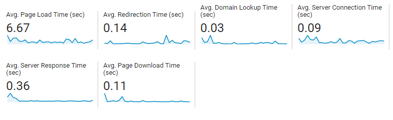
Make your website load quickly, you have no more than 3 seconds before visitors start to lose patience and return to the search engine they came from. The faster your site, the happier your visitors will be. No one wants to wait for a website to load, so make sure yours is optimised for speed. This means using small file sizes for images and videos, and minifying CSS and JavaScript code. Use the Google Speed Tool to test the speed of your website. The tool also provides hints and tips for improving performance although you might need help with the implementation.


3/ Don’t lose sight of your website’s target.
It’s very easy to do as you get deeper in to content creation. You hit your stride talking about the things you love but customers don’t need to know everything, they need to know how your products/services will make their lives better.

They want to know the benefits, what they will get out of engaging with you, not a list of the “things” you do, no matter how exciting you find it. There’s a well worn phrase that covers this, “Sell the Sizzle, not the Steak” because it’s the sizzle, the sound of hot steak, the smell of the hot steak that sets their imagination running. You can read more about this here.

Keep your audience in mind. Who are you designing your website for? What are their needs and interests? Make sure your website is easy to use and navigate, and that the content is relevant to your audience.


3/ Design
Use a clear and consistent design. Your website should have a consistent look and feel throughout, from the colours and fonts to the layout and typography. This will help your customers understand that they are still on your site, no matter how deep they get. It will help them find their way around, create a sense of visual harmony and make your website more user-friendly.


An image with the word "Quality"

4/ Images
The Chinese reckon than 1 image is worth 1,000 words. Not only do pictures communicate concepts and ideas far faster than words they can be immediately assimilated. Pictures, used properly, also break your content up and make a page look more appealing and easier to read.

Use high-quality images and videos, preferably ones that you have taken (or had taken for you) rather than stock images that can be seen on hundreds of similar websites. 

The use of Images supports and boosts your SEO (with properly named files and effective Alt Tags) whilst videos have to be optimised in their own right for optimum “findability”. Make sure your images are high-resolution and your videos are clear and engaging. And remember, YouTube is the 2nd most searched sit on the web.
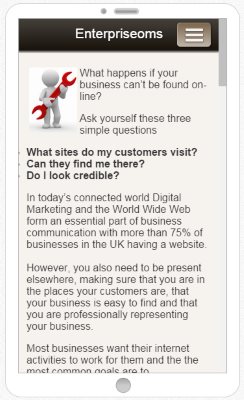

Mobile phone user stood on a beach

5/ Think Mobile
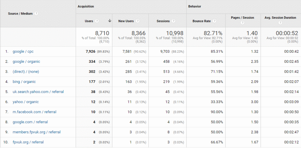
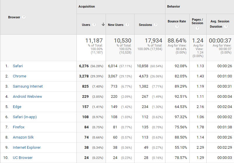
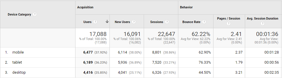
Over 1/2 of the visits to your website are likely to come from a mobile device, check Google Analytics data for your own website. The higher the percentage, the more you need to focus on the mobile experience ensuring your website is optimised for mobile devices. This means using a responsive design that will adjust to the size of the screen.

Don’t take it on trust from your web developer that your website “works on mobile”. It might be OK but check it yourself, or better yet, ask somebody who hasn’t been involved in the development of the site to check it out – from a customers perspective.

And Google will look at the mobile version of your website first, so a mobile focus also helps your SEO.


7/ Keep it simple.
Your website’s navigation should be easy to understand and use. Make sure your main menu is clear and concise, and that your submenus are organized in a logical way. Steer clear of using jargon in your navigation. You might know what it means but potential customers may not.

Ensure similar products and services are in groups (or families) and make sure they link to each other. This helps visitors and Google. If you have a lot of pages then use a Post-It note per page and use them to help with organisation by grouping relevant ones together.


Cover of Don't Make Me think by Steve Krug

8/ Calls to Action
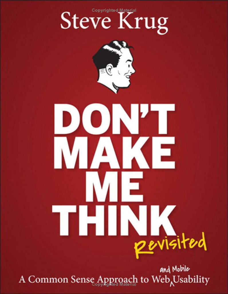
Don’t leave your customers to guess what you want them to do. In his book, “Don’t make me think” by expert Steve Krug, Steve has condensed his knowledge in to the title. If a visitor to your site has to think “what’s the next step?” or “what do they want me to do now?” then you’ve already lost them. Your page has to do all the hard work, you can’t see customer’s body language and you can’t hear interest in the tone of their voice when on the phone.

To overcome this you need to use clear calls to action. Tell your visitors what you want them to do, whether it’s signing up for your email list, making a purchase, or calling you for more information. Your calls to action should be clear, concise, and easy to find.


SEO written on a piece of glass

9/ Use effective SEO. 
Search engine optimisation (SEO) is the process of making your website more visible in search engine results pages (SERPs). There are a number of things you can do to improve your website’s SEO, such as using relevant keywords and phrases, creating high-quality content, and building backlinks.

The starting point is understanding the words and phrases your customers are likely to use when looking for what it is you do. Then you need to embed those words and phrases in your website in the places that the search engines examine.


10/ Test and iterate. 
Once your website is up and running, don’t just sit back and wait for visitors to come. Test and iterate your website regularly to see what’s working and what’s not. This will help you improve your website over time and make it more successful.

These are just a few of the golden rules of website design for 2023. By following these principles, you can create a website that is both beautiful and functional, and that will help you achieve your business goals.


In addition to these 10 golden rules, there are a few other trends that are important to keep in mind when designing websites in 2023. These include:

  • The rise of voice search: More and more people are using voice search to find information online. This means that your website should be optimized for voice search, using clear and concise language that is easy for people to understand.
  • The importance of video: Video is becoming increasingly popular online, and it’s a great way to engage visitors and communicate your message. Make sure your website includes high-quality videos that are relevant to your content.
  • The focus on user experience (UX): User experience (UX) is more important than ever before. Your website should be easy to use and navigate, and it should provide a positive user experience.

By following these trends and principles, you can create a website that is both effective and visually appealing. This will help you attract more visitors, convert more leads, and grow your business.


What to do next. – This is the call to action for this post.
If you would like an impartial review/evaluation of your website, or are thinking about launching a new site then get in touch and I’ll be only too happy to help.

I can help with your website, your SEO, your Social Media, Email Marketing and much more and I even offer a free consultancy session. You can just drop me an email or just give me a call on 01793 238020 or 07966 547146.

Boing, Boing, Boing. What’s the Bounce Rate?

I’ve been a fan of Google’s web metrics tool (Google Analytics) since it was introduced in 2005. For most businesses, it’s free to use. The necessary tracking code is easy to add to your website and provides a wealth of information about your site’s performance but the Bounce Rate is one of the most powerful metrics, a powerful insight into the minds of the people who are visiting your website.

And yet all the Bounce Rate does is record the percentage of people who visit your website but leave almost straight away without doing anything more than viewing the page they landed on.

With 15 year’s experience, my view of the Bounce Rate is as follows

0-20% – Phenomenal. In 15 years I think I’ve only come across 4-5 sites with a Bounce Rate in this area and one of those was only because the site hadn’t installed Google Analytics correctly.

21-50% – Most of the sites that I work with fall into this region. One where between 1 in 5 and 1 in 2 visitors leave the site without doing anything

+51% – Any website with a Bounce Rate of 51% and higher really needs the reasons investigating. These sites are hemorrhaging visitors and, more importantly, opportunities but HOW do you go about analysing a high Bounce Rate and turning things around.

Remember, a 51% Bounce Rate (BR) means that over half of the people that you have persuaded to visit your website, whether that’s by SEO, Google Ads, Social Media (And Social Media advertising), e-mail and video marketing or simply word of mouth are just leaving without doing anything meaningful. If your website were a shop, they’d be sticking their head through the door, shrugging their shoulders and moving on. As a consequence, this has to be worth investigating. After all, if you invest in more marketing, all that’s going to continue to happen is that over half of those you attract will just do as the 51%+ have done before – and leave.

Working to reduce the Bounce Rate. Where do you start?

First, ensure that you have a really good understanding of your website because if you don’t know what you want your website to do for your business how do you know whether it’s doing it – or not.

What are the goals of your website? Here are some common ones.

  • To sell something
  • To attract newsletter subscriptions
  • To encourage inquiries
  • To allow people to download something

If your website has a high Bounce Rate where do you start looking? There are many ways to approach this, but I always like to start by taking a look at the website itself. What message is it sending to visitors?

Let’s say, for example, that you sell widgets and those widgets are used to attach the engines to an airliner.

Having a large photo of an airliner at the top of your home page probably looks good to you. And, because you know that your widgets play an important part then it sends a message – to you, and you alone. To everybody else all it actually says is “here’s a pretty picture of an airliner”. Questions that could come into the visitor’s mind might be “is this a travel company?” “do they make the whole airliner” – not – “aha, these are the guys that make the widgets that hold this airliner’s engines on”.

Remember, although you may have 3 seconds to get your webpage open in front of your visitor that’s an eternity compared to the 2/10ths of a second that a visitor takes to “get” your website……..or not!

Once happy with the website the next place that I’d look would be at marketing activity. Are the messages being broadcast by the marketing actually delivered by your website? For example, it’s no good talking a two-for-the-price-of-one offer if there’s no mention of it on your website, or if the offer is difficult to find. Visitors won’t look around – they’ll leave (bounce) and may never come back

Now that the marketing messages align with your website, and your website is as good as it can be, it’s time to dive into the data provided by Google Analytics.

Using Google Analytics to troubleshoot the Bounce Rate

The first place I look is the source of your web visitors.

Google Analytics/Acquisition/All traffic/Source/Medium will answer this one

Website traffic Sources in Google Analytics
Website Traffic Sources in Google Analytics

Traffic Sources Key

Any entry that’s tagged “/referral” is where a visitor to your site has followed a link published on a 3rd party website. This could be an indicator as to how your online marketing is performing

  1. CPC = Google Ads
  2. Google Organic = Google Free Search Results
  3. Direct = Either Google can’t identify the source or people have entered the URL directly in their browser
  4. Bing Organic = Traffic from Bing (Microsoft search)
  5. UK Search Yahoo Organic = Traffic from Yahoo UK
  6. Yahoo Organic= Traffic from Yahoo
  7. m.Facebook = Traffic from Facebook on a phone or tablet
  8. Google.com = Traffic from Google.com
  9. Traffic from a third party website
  10. Traffic from a third party website

For this particular website, you’ll see that the Bounce Rate is very high for the majority of traffic sources and particularly high for visitors from Google Ads. With the majority of sources having a high Bounce Rate it would appear that the problem either lies with the marketing that is attracting the wrong people to the site, the website is failing to meet expectations or the problem lies elsewhere.

Bearing in mind that one of the earlier exercises was to ensure that marketing was sending the right message it’s obvious that, for this website, the problem with the Bounce Rate lies somewhere else

Geographical Source of traffic

Navigate to Audience/Geo/Location in Analytics

Scroll down past the map to see the countries where the traffic is coming from. You’ll see the Bounce rate for each source country. If you are targeting the UK and your UK Bounce Rate is OK then the next step is to try to understand how your marketing is promoting your traffic outside of the UK.

It’s possible that your website is attracting visitors from markets that you don’t serve. I have seen a number of sites that have attracted a lot of visits from the USA. When American visitors have landed it becomes immediately obvious that the website can’t address their needs so they leave immediately (Bounce).

The reality is that there is probably very little that you can do about this but it’ll be a relief to see that the Bounce Rate for your target locations is OK.

For this site, the Bounce Rate is high for all countries so the answer doesn’t lie here and the hunt continues

Visitor Demographics

Navigate to Audience/Demographics/Age in Google Analytics

Although Google can’t identify all visitors to your website it’s still worth checking the visitor demographics. You can check that your website is reaching the age groups that your business is targeting.

Again, for the website being used in this blog, the Bounce Rate is high across the board so the answer lies elsewhere.

Navigate to Audience/Demographics/Gender in Google Analytics

Some companies target specific genders and this enables you to make sure that your visitors are coming from your target demographic. Once again, with a high Bounce Rate for both genders, the answer isn’t here. The hunt continues.

Web Browser Issues

Navigate to Audience/Technology/Browser & OS in Google Analytics

Web browsers are complicated pieces of software and it’s not unusual for websites to hit problems with some browsers and not others. This screen looks at the browsers used by visitors to your website and the Bounce Rate per browser. If a particular browser has a high Bounce Rate, but only delivers 5% of visitors (or fewer), it’s not worth paying too much attention. The cost to investigate, and resolve, the problem probably outweighs the benefits

This website is performing poorly in all browsers so the problem isn’t here either and the hunt continues.

Mobile Issues

Navigate to Audience/Mobile/Overview in Google Analytics

We are all used to accessing the web on our phones, but how well does your website work on small screens. It’s possible that this is the cause of the high Bounce Rate.

Now we’re getting somewhere. Desktop visits have a Bounce Rate in the comfort zone (44.50%) whilst phones and tablets are well above 50%.

Take a detailed look at your website, using your phone. Try to act as a customer and see whether you can spot any problems. Is the site slow? Is the navigation poor? Is excessive scrolling required?

Ask friends, colleagues, family to do the same, and feedback their findings and thoughts.

Next, take it up with your web developer.

Site Speed

Navigate to Behaviour/Site Speed/Overview in Google Analytics

I think we have gotten to the nub of the problem. This is a slow website. Although the server is quite slow to respond (0.36 seconds) the technical elements (screenshot above) taken to find the website and start to open it on a device are still under 1 second so the problem lies with the content of the website itself.

Navigate to Behaviour/Site Speed/Page Timings in Google Analytics

Google Analytics page speed performance chart
Page Speed Report – blurred to protect the company

This page looks at the performance of every page of your website and details the speed of each page as a + or – when compared to the site average. It helps to identify poor performing pages.

Navigate to Behaviour/Site Speed/Speed Suggestions in Google Analytics and Google will provide information and recommendations as to the actions you should take to improve the speed of your website. This might be a list that you take up with your web developer

Another way to identify issues is to put your website URL into https://www.webpagetest.org . This site runs a speed test three times and then displays the results as a waterfall graph, highlighting the speed of each element of a website, enabling you to identify problem areas.

A web page speed test waterfall chart

Summary

So, there you have it, a detailed look into the Bounce Rate, and the ways that you can use Google Analytics to identify issues so that you can take corrective action.

Thanks for reading and you need more help with your website’s Bounce Rate or anything else to do with your web marketing all you have to do is get in touch. I’ll be only too happy to answer any questions that you might have.

And Finally

Don’t forget that you can book a FREE 40 minute consultation with me.

Find me: https://seo.enterprise-oms.uk/  |  andy@enterprise-oms.co.uk
Follow Me: Twitter ¦ Linkedin
Phone Me: 01793 238020 ¦ 07966 547146

Have you heard of The SMOG* Test?

It’s nothing to do with clean air but IS all about the readability of your website.

Did you know that the average reading age in the UK is 12-13 years and that a significant number of visitors to your website may have English as their second language?

If you haven’t given this any thought then you are probably losing visitors and business because your words could act as an impenetrable barrier and you could be losing custom.

Not only that but Google take more than a passing interest in readability.

There is a simple tool that you can use to calculate the reading age of your site and you really should apply this RIGHT NOW.

All you have to do is go to www.read-able.com, copy some text from your website that you want to test and paste it in to the “TEST BY DIRECT INPUT”Readability Test at read-able.com

Your pages will be parsed through 6 different tests [including the SMOG* test] and the individual results will be displayed together with an average.

Take a look at the Readability Test results

Readability test results

As you can see, the test results for the text that I pasted show that the reading age is 15-16 years and so a little owrk is required.

The results are provided in both age and US Grade Levels and you can find a simple Grade to Age comparison here.

Alternatively you could also try the “Drayton Bird test” by reading your content out loud. If it sounds like one side of a conversation the you are probably on the right track, if it sounds stilted and disjointed you need to go back to the drawing board!

How to make your text easier to read

If you need help with making your text easier to read you could turn to the free Hemmingway App for help.

Hemmingway App

In the screenshot, above, you can see that the App has highlighted areas for improvement, and as you make edits you’ll see the reading age on the right-hand side of the page reduce, and the highlighted text will start to disapear.

After a “first pass” you can see that the reading age has already come down. And if I paste this text in to Read-Able you can see that the reading age has fallen to 12-13, much closer to the target, and achieved without any Dumbing Down

Read-Able test results

And if you need any help with your website, search engine optimisation, social media, email marketing or any other form of online activity then all you have to do is #AskAndyP

Ring Me:      01793 238020      07966 547146
Email Me:    andy@enterprise-oms.co.uk
Find Me:      Linkedin     Twitter
Visit Me:     Bowman House, Whitehill Lane, Royal Wootton Bassett, Wilts, SN4 7DB

*SMOG – Simple Measure of Gobbledygook

To Carousel or not to Carousel, that is the question.

Carousels, (aka Image Sliders) the name given to those annoying sliding images that seem to feature on most websites these days. As you might have gathered, I’m not a fan but is my dislike subjective (taste) or objective (they don’t add anything).

It’s objective and here’s why

1/ the human eye doesn’t respond well to movement – or maybe it responds too well.
We may not live in the jungle anymore, but we did once. Our brains are wired to react to sudden movement, and this movement is called a saccade. It’s our retina’s uncontrollable response to movement, and the speed of movement during each saccade can’t be controlled. The eyes move as fast as they are able.

This might have been great when hunting prey in prehistoric times whilst trying to make sure the odd sabre toothed tiger can’t creep up on us, but today, it’s your slider fighting for your attention.

2/ They take control away from the visitor
Visitors like to be in control when they arrive on your website. They don’t want to see something they have no use for, and frankly, the whole point of your website should be to give your visitor what they came for.

When you put an auto-rotating image slider on your homepage you take control out of your user’s hands and give it to the slider. You know what follows? Disaster. Image sliders keep rotating, attention keeps being grabbed and web visitors loose patience. This is not only frustrating, but is terrible for usability according to UX Movement.

3/ They take up Space and hardly get clicked?
How many times have you watched a slider waiting for something useful to appear? If it’s more than once then you’re in the minority.

You already know image sliders are so fast and distracting, visitors tend to ignore them. Erik Runyon ran a study at Notre Dame University  to test and measure the number of clicks made on the sliders in comparison to homepage visits and you know what?

The study revealed a mere 1% of visitors clicked on a feature on the slider. That’s like the unicorn of bad conversions.

4/ They reduce visibility
The Neilson Norman group (founded by Jakob Nielsen, “the Guru of website usability” New York Times) group ran a usability study, where a user was attempting to search special deals on Siemens washing machines. The user arrived on the Siemens homepage that looked like this with a deal on a washing machine at the top of the page.

  • The user didn’t spot the deal
  • She ignored the offer placed in a small box in the left-hand corner.
  • Then she ignored the big banner splattered on the page, even though it had an image of a washing machine on it.

Because the image slider looked so much like an ad, she left the website without buying the machine, costing Siemens an easy sale.

Jakob Nielson also pointed out that international users and users with low literacy get easily distracted and frustrated by the image sliders, as they are unable to read through one offer before another slides into place.

The bottom line is image sliders are ineffective. And to reinforce this idea, here’s a slider by WebAIM. [If you only follow one link, you should follow this one]

Why you should not use an image carousel

And if you need help with your SEO and/or anything else to do with your website and digital footprint then please get in touch. Give me a call on 01793 238020 or send an email to andy@enterprise-oms.co.uk for a free, zero obligation chat.

Responsive Design – what is it and what’s all the fuss about.

When the internet was quite new, we were working on screens of 800×600 resolution – thats 800 tiny dots [pixels] wide and 600 highcomputer monitors. As screen technology improved we moved to 1024 x 768 and then wide screen monitors began to take over.

Web developers faced a bewildering range of screens and no solution was ideal.

If they designed sites for smaller screens then websites that were viewed on wide screen monitors had large expanses of empty space, if they focussed development on the wider screens then small screen users were left with two options, scoll across the page horizntally or go to a different site. The majority voted with a click and chose to go elsewhere..

Sony Ericson P990iSmartPhones are going through a similar metamorphosis. screens are getting larger and resolution is getting higher which means content [words and pictures] has a tendency to look smaller. One of my early Smartphones, a Sony P990 had a screen that was 2.7″ with a resolution of 320×240 whilst my current phone, an HTC One has a screen that’s 4.7″ across with a resolution of 1080 x 1920, the same as a full HD TV in other words.

This means that desktop sites designed for widescreen monitors do “fit” on the screen but the text is so tiny in most cases as to be unreadable. Yes, i know that I can use my fingers to zoom in and zoom out, but like many people, I find that’s just too much of a faff and websites that don’t make it easy for me to read and navigate simply get ignored.

So, how do you go about making sure that your website isn’t ignored by mobile users?

There are three options, although one of them isn’t really an option, it’s simply to turn a blind eye to the problem and ignore everyone that uses a phone. They won’t like that, and will probably ignore you and Google will probably ignore you too – and neither of those are good for business.

Mobile version of www.enterprise-oms.co.ukThe second option is to have a mobile version of your website developed and hosted at http://m.yourwebsite.co.uk. This is not too expensive to achieve and can easily and quickly overcome many of the obstacles. www.dudamobile.com will even get you on your way for nothing, nada, zero. It took seconds to produce the simple version of this very site and, with a little more time spent on editing, it would become extremely user friendly and usable.

However, I have opted for the third, and for the moment, the best option, using something called Responsive Design.

website using responsive designSimply put, Responsive Design is built in to my site, it’s not a stand-alone mobile only version which makes it suitable for tablets as well as phones. Responsive Design is able to assess the resolution and size of the screen being used to access this website and automatically re-size the site to make the navigation easy and ensure that the content is easy to read.

You can see the result of one of the pages to the left. A word of caution though, it does mean that your website will have to be completely rebuilt and it could add to the cost so it might only be an option when you are ready to revamp your site.

However, don’t leave it too long. You’ll get left behind and your clients may very well choose to vote with their fingers so give me a call on 01793 238020 or email andy@enterprise-oms.co.uk if you want some help meeting this challenge.

How ready is your business for marketing online?

I recently read a post on www.SmallBusinessNewz.com that says many small businesses do nothing to enhance their on-line presence and 90% have not even considered paid web marketing such as Pay per Click [aka Google Ads, PPC] or sponsored updates on Social Media sites.

£20 notesPersonally, I think that this is good news even though I may disagree with the one of the main reasons they give – they believe that it may be too expensive and not deliver results.

I know that a properly constructed and managed campaign WILL most certainly deliver results and does not have to be expensive. However, campaigns that are rushed in to place and ineffectively managed will simply feed the money hungry machines that are Google, Facebook etc.

What’s even worse is that even a well set up and managed campaign may not deliver the wished for results because the website at the end of the click may not be up to the task.

It would be like advertising the opening of a new supermarket, building demand and expectation and then throwing open the doors only to have the shelves half stocked and no one around to help or take your money. A wasted opportunity! Not only a wasted opportunity but a wasted future because people who have had their expectations dashed will never return and (and this is just as bad) spread the word.

So, a business with a website that is unsatisfactory from a visitors perspective should NOT embark on any new marketing activity until

  • the destination website is up to scratch.
  • they are sure they have the resources to deal with an uplift in enquiries and / or sales

What do I mean by having a website that is “up to scratch”? Watch this space for my next post.