What’s the Difference between the WWW and the Internet?

Although people seem to use the terms WWW and Internet interchangeably, the two are actually very different beasts

The Internet

There is a belief that the Internet came about through military research. The US government needed to find a way to send the “launch” message to ICBM silos in the event of the telephone network being disabled.

Although the US military contributed to the formation of the internet it was a lot more than this, and was mainly in the academic domain.

A visual representation of the Internet by The Opte Project

In the early 60s various projects in the US, UK and France had the aim of building, and interconnecting, computer networks, particularly the Super Computers of the day, for data sharing and data transmission.

In 1974 research was published that evolved in to the Transmission Control Protocol (TCP) and the Internet protocol (IP), the basic technologies that are used to send computer data from one location to another.

In the early 80s the American National Science Foundation funded a number of supercomputers at several US universities, provided interconnectivity between them and also built a network that allowed by other academic institutions for research. This marked the beginning of the internet.

The first Internet Service Providers emerged in the USA & Australia in 1989 and in 1990 a small number of commercial entities in the USA were provided with private connections to this network. Connectivity increased rapidly, and the Internet as we know it, was born.

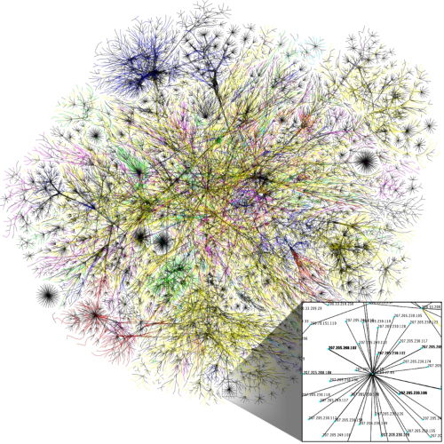
The Internet is the structure along which data travels when going from A to B and can be likened to a road network. And, like a road network, there are some routes that are faster than others and even the fast routes suffer from occasional issues and blockages which slows things down.

The World Wide Web

In 1989-90 research at CERN, in Switzerland, by British computer scientist, Tim Berners Lee (now Sir Tim) saw the development of a technology that linked hypertext documents in to an information system which was then accessible from any node (connection) on the network.

Sir Tim released his research in tot the world and allowed it to be used without any license fees and this allowed it to become the defacto document standard for the world wide web. This is why all web addresses start with HTTP, it defines the protocol to be used to transmit documents, Hypertext Transmission Protocol although we are now more familiar with HTTPS where the S adds Secure.

Basically, the Internet is the structure along which the data travels (the road system mentioned in the previous section) whilst the World Wide Web is the data that travels across that network, like traffic on a road.

If you need any help with your presence on the World Wide Web, from your website through Search Engien Optimisation (SEO), Advertising or anything else I’ll be more than happy to have a free chat to see how/where I can help your business. All you have to do is call me on 01793 238020, email andy@enterprise-oms.co.uk or just search Chief SEO Officer.

To Carousel or not to Carousel, that is the question.

Carousels, (aka Image Sliders) the name given to those annoying sliding images that seem to feature on most websites these days. As you might have gathered, I’m not a fan but is my dislike subjective (taste) or objective (they don’t add anything).

It’s objective and here’s why

1/ the human eye doesn’t respond well to movement – or maybe it responds too well.
We may not live in the jungle anymore, but we did once. Our brains are wired to react to sudden movement, and this movement is called a saccade. It’s our retina’s uncontrollable response to movement, and the speed of movement during each saccade can’t be controlled. The eyes move as fast as they are able.

This might have been great when hunting prey in prehistoric times whilst trying to make sure the odd sabre toothed tiger can’t creep up on us, but today, it’s your slider fighting for your attention.

2/ They take control away from the visitor
Visitors like to be in control when they arrive on your website. They don’t want to see something they have no use for, and frankly, the whole point of your website should be to give your visitor what they came for.

When you put an auto-rotating image slider on your homepage you take control out of your user’s hands and give it to the slider. You know what follows? Disaster. Image sliders keep rotating, attention keeps being grabbed and web visitors loose patience. This is not only frustrating, but is terrible for usability according to UX Movement.

3/ They take up Space and hardly get clicked?
How many times have you watched a slider waiting for something useful to appear? If it’s more than once then you’re in the minority.

You already know image sliders are so fast and distracting, visitors tend to ignore them. Erik Runyon ran a study at Notre Dame University  to test and measure the number of clicks made on the sliders in comparison to homepage visits and you know what?

The study revealed a mere 1% of visitors clicked on a feature on the slider. That’s like the unicorn of bad conversions.

4/ They reduce visibility
The Neilson Norman group (founded by Jakob Nielsen, “the Guru of website usability” New York Times) group ran a usability study, where a user was attempting to search special deals on Siemens washing machines. The user arrived on the Siemens homepage that looked like this with a deal on a washing machine at the top of the page.

  • The user didn’t spot the deal
  • She ignored the offer placed in a small box in the left-hand corner.
  • Then she ignored the big banner splattered on the page, even though it had an image of a washing machine on it.

Because the image slider looked so much like an ad, she left the website without buying the machine, costing Siemens an easy sale.

Jakob Nielson also pointed out that international users and users with low literacy get easily distracted and frustrated by the image sliders, as they are unable to read through one offer before another slides into place.

The bottom line is image sliders are ineffective. And to reinforce this idea, here’s a slider by WebAIM. [If you only follow one link, you should follow this one]

Why you should not use an image carousel

And if you need help with your SEO and/or anything else to do with your website and digital footprint then please get in touch. Give me a call on 01793 238020 or send an email to andy@enterprise-oms.co.uk for a free, zero obligation chat.

How to set expectations and fail to deliver

Old petrol pumpI don’t like filling my car with fuel, but not for the reason you might think!

It’s not the cost, that’s just an unchangeable part of life, no it’s the temptation when I go to pay. Chocolate bars, crisps, sweet drinks, gadgets and all those essential “must haves” strategically placed between the door and the till to tempt you.

That’s why I much prefer “pay at pump” options and can’t wait for the day when all garages offer this.

I needed fuel recently so imagine my delight when I saw that Shell are partnering with PayPal to enable “pay at pump” simply by scanning a code on my phone, telling the App how much I wanted to spend and then just filling up without going in to the shop.

Shell call this “Fill up & Go” and it’s being rolled out across the UK later this year.

Shell Fill and GoI discovered this by reading a card attached to the pump that I was using, it had a picture attached to it, not unlike the one here with the added message that there was more information “in store”

When paying for my fuel, and successfully avoiding temptation, I picked up a leaflet that answered a lot of my questions and which told me “If you want to be one of the first to use it, visit our website to register your interest, www.shell.co.uk”

So, when I reached my destination, I went to www.shell.co.uk and was instantly, and automatically, sent to www.shellsmart.com where I learned I could get a Shell loyalty card, find out more information about Shell’s “Partners” and other information but NOTHING about paying at the pump via PayPal

So, I scrolled down the ShellSmart page and found a link to Shell.co.uk and finally managed to reach the Shell website.

I expected to see information about “Fill up & Go” front and centre, but it wasn’t.

Where was it? I still don’t know, I scrolled down the page, I clicked on some links, I read some text and finally gave up in frustration. What a waste of time.

Why couldn’t Shell have had info right in front of my eyes or used a dedicated URL on their leaflet, www.shell.co.uk/FillAndGo for example?

Not difficult, not even clever but it would certainly have saved me from frustration and meltdown with yet another corporate entity which has a good idea but fails in the execution.