
When the internet was quite new, we were working on screens of 800×600 resolution – thats 800 tiny dots [pixels] wide and 600 high . As screen technology improved we moved to 1024 x 768 and then wide screen monitors began to take over.
Web developers faced a bewildering range of screens and no solution was ideal.
If they designed sites for smaller screens then websites that were viewed on wide screen monitors had large expanses of empty space, if they focussed development on the wider screens then small screen users were left with two options, scoll across the page horizntally or go to a different site. The majority voted with a click and chose to go elsewhere..
 SmartPhones are going through a similar metamorphosis. screens are getting larger and resolution is getting higher which means content [words and pictures] has a tendency to look smaller. One of my early Smartphones, a Sony P990 had a screen that was 2.7″ with a resolution of 320×240 whilst my current phone, an HTC One has a screen that’s 4.7″ across with a resolution of 1080 x 1920, the same as a full HD TV in other words.
This means that desktop sites designed for widescreen monitors do “fit” on the screen but the text is so tiny in most cases as to be unreadable. Yes, i know that I can use my fingers to zoom in and zoom out, but like many people, I find that’s just too much of a faff and websites that don’t make it easy for me to read and navigate simply get ignored.
So, how do you go about making sure that your website isn’t ignored by mobile users?
There are three options, although one of them isn’t really an option, it’s simply to turn a blind eye to the problem and ignore everyone that uses a phone. They won’t like that, and will probably ignore you and Google will probably ignore you too – and neither of those are good for business.
 The second option is to have a mobile version of your website developed and hosted at http://m.yourwebsite.co.uk. This is not too expensive to achieve and can easily and quickly overcome many of the obstacles. www.dudamobile.com will even get you on your way for nothing, nada, zero. It took seconds to produce the simple version of this very site and, with a little more time spent on editing, it would become extremely user friendly and usable.
However, I have opted for the third, and for the moment, the best option, using something called Responsive Design.
 Simply put, Responsive Design is built in to my site, it’s not a stand-alone mobile only version which makes it suitable for tablets as well as phones. Responsive Design is able to assess the resolution and size of the screen being used to access this website and automatically re-size the site to make the navigation easy and ensure that the content is easy to read.
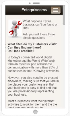
You can see the result of one of the pages to the left. A word of caution though, it does mean that your website will have to be completely rebuilt and it could add to the cost so it might only be an option when you are ready to revamp your site.
However, don’t leave it too long. You’ll get left behind and your clients may very well choose to vote with their fingers so give me a call on 01793 238020 or email andy@enterprise-oms.co.uk if you want some help meeting this challenge.