10 Golden Rules of Website Design

Key question – Who is your website for?

If you answered that it’s for your customers then go to the top of the class because all too frequently I work with websites that either have little or no focus or are simply flights of fancy for the chief executives or business owners.

Woman wearing glasses and thinking about good website design

The key to having a successful website is understanding what it is that your customers need to enable them to open communications, leading (hopefully) to business transactions.

I built my first commercial website in 1995 and have watched website design develop and evolve, with new technologies, user behaviours, and design trends shaping the way we create digital experiences.

Some of these new ideas have been great and have moved the design principles forward whilst many (such as scrolling images, aka scrollers, aka image carousels have seriously held good design back. Here’s my thoughts on Image Carousels.

Let’s get past trends and fashions and take a look at 10 golden rules of website design which combine timeless principles with modern considerations to ensure your website is not only visually appealing but also user-friendly, accessible, and effective at achieving its goals.

You do know what your goals for your website are, don’t you?

1/ Start with a clear purpose. 
As the old saying goes, “if you don’t know where you are going, how will you know when you’ve arrived?”

What is the goal of your website?

What do you want your website to achieve? Do you want to generate leads, sell products, or simply provide information?

Once you know your purpose, you can start to design a website that will help you achieve it. Think about the information your customers need. Group the pages together into topic/subject/project families to make it easy for customers to find the information they need. This also helps the search engines understand how your services/products sit together.


Speedometer for a fast website

2/ Speed.
Make your website load quickly, you have no more than 3 seconds before visitors start to lose patience and return to the search engine they came from. The faster your site, the happier your visitors will be. No one wants to wait for a website to load, so make sure yours is optimised for speed. This means using small file sizes for images and videos, and minifying CSS and JavaScript code. Use the Google Speed Tool to test the speed of your website. The tool also provides hints and tips for improving performance although you might need help with the implementation.


3/ Don’t lose sight of your website’s target.
It’s very easy to do as you get deeper in to content creation. You hit your stride talking about the things you love but customers don’t need to know everything, they need to know how your products/services will make their lives better.

They want to know the benefits, what they will get out of engaging with you, not a list of the “things” you do, no matter how exciting you find it. There’s a well worn phrase that covers this, “Sell the Sizzle, not the Steak” because it’s the sizzle, the sound of hot steak, the smell of the hot steak that sets their imagination running. You can read more about this here.

Keep your audience in mind. Who are you designing your website for? What are their needs and interests? Make sure your website is easy to use and navigate, and that the content is relevant to your audience.


3/ Design
Use a clear and consistent design. Your website should have a consistent look and feel throughout, from the colours and fonts to the layout and typography. This will help your customers understand that they are still on your site, no matter how deep they get. It will help them find their way around, create a sense of visual harmony and make your website more user-friendly.


An image with the word "Quality"

4/ Images
The Chinese reckon than 1 image is worth 1,000 words. Not only do pictures communicate concepts and ideas far faster than words they can be immediately assimilated. Pictures, used properly, also break your content up and make a page look more appealing and easier to read.

Use high-quality images and videos, preferably ones that you have taken (or had taken for you) rather than stock images that can be seen on hundreds of similar websites. 

The use of Images supports and boosts your SEO (with properly named files and effective Alt Tags) whilst videos have to be optimised in their own right for optimum “findability”. Make sure your images are high-resolution and your videos are clear and engaging. And remember, YouTube is the 2nd most searched sit on the web.


Mobile phone user stood on a beach

5/ Think Mobile
Over 1/2 of the visits to your website are likely to come from a mobile device, check Google Analytics data for your own website. The higher the percentage, the more you need to focus on the mobile experience ensuring your website is optimised for mobile devices. This means using a responsive design that will adjust to the size of the screen.

Don’t take it on trust from your web developer that your website “works on mobile”. It might be OK but check it yourself, or better yet, ask somebody who hasn’t been involved in the development of the site to check it out – from a customers perspective.

And Google will look at the mobile version of your website first, so a mobile focus also helps your SEO.


7/ Keep it simple.
Your website’s navigation should be easy to understand and use. Make sure your main menu is clear and concise, and that your submenus are organized in a logical way. Steer clear of using jargon in your navigation. You might know what it means but potential customers may not.

Ensure similar products and services are in groups (or families) and make sure they link to each other. This helps visitors and Google. If you have a lot of pages then use a Post-It note per page and use them to help with organisation by grouping relevant ones together.


Cover of Don't Make Me think by Steve Krug

8/ Calls to Action
Don’t leave your customers to guess what you want them to do. In his book, “Don’t make me think” by expert Steve Krug, Steve has condensed his knowledge in to the title. If a visitor to your site has to think “what’s the next step?” or “what do they want me to do now?” then you’ve already lost them. Your page has to do all the hard work, you can’t see customer’s body language and you can’t hear interest in the tone of their voice when on the phone.

To overcome this you need to use clear calls to action. Tell your visitors what you want them to do, whether it’s signing up for your email list, making a purchase, or calling you for more information. Your calls to action should be clear, concise, and easy to find.


SEO written on a piece of glass

9/ Use effective SEO. 
Search engine optimisation (SEO) is the process of making your website more visible in search engine results pages (SERPs). There are a number of things you can do to improve your website’s SEO, such as using relevant keywords and phrases, creating high-quality content, and building backlinks.

The starting point is understanding the words and phrases your customers are likely to use when looking for what it is you do. Then you need to embed those words and phrases in your website in the places that the search engines examine.


10/ Test and iterate. 
Once your website is up and running, don’t just sit back and wait for visitors to come. Test and iterate your website regularly to see what’s working and what’s not. This will help you improve your website over time and make it more successful.

These are just a few of the golden rules of website design for 2023. By following these principles, you can create a website that is both beautiful and functional, and that will help you achieve your business goals.


In addition to these 10 golden rules, there are a few other trends that are important to keep in mind when designing websites in 2023. These include:

  • The rise of voice search: More and more people are using voice search to find information online. This means that your website should be optimized for voice search, using clear and concise language that is easy for people to understand.
  • The importance of video: Video is becoming increasingly popular online, and it’s a great way to engage visitors and communicate your message. Make sure your website includes high-quality videos that are relevant to your content.
  • The focus on user experience (UX): User experience (UX) is more important than ever before. Your website should be easy to use and navigate, and it should provide a positive user experience.

By following these trends and principles, you can create a website that is both effective and visually appealing. This will help you attract more visitors, convert more leads, and grow your business.


What to do next. – This is the call to action for this post.
If you would like an impartial review/evaluation of your website, or are thinking about launching a new site then get in touch and I’ll be only too happy to help.

I can help with your website, your SEO, your Social Media, Email Marketing and much more and I even offer a free consultancy session. You can just drop me an email or just give me a call on 01793 238020 or 07966 547146.

10 Essential Web Analytics Terms You Need to Know

Google Analytics 4 (GA4) graph showing visitor data

Web analytics is the process of collecting, analysing, and interpreting data about website usage. Understanding the data will help you understand how visitors are using your website, and this is information that you can feed back into the design of your website.

To make the most of your website’s data it’s important to understand key terms like bounce rate, conversion rate, and sessions. Google Analytics is the most used by SMEs. Google Analytics 3 provides a lot of information about the way visitors use, interact with and move through a website. However, GA3 is highly reliant on tracking cookies, something that the EU have taken against on privacy grounds. As a result, at the time of writing, Google is in the middle of migrating from Google Analytics 3 (GA3) to Google Analytics 4 (GA4), a migration that is due to be completed by June 2023.

To help you understand the most important GA4 metrics here are 10 essential web analytics terms to get you started.

1/ Users

This is the count of visitors to your website within a specific time frame. The count starts when a visitor enters your website and ends when they leave, or after a period of inactivity, usually 30 minutes. Users numbers are important to understand, although it’s equally important to understand what they do whilst they are on your website and how long they stay on it.

2/ Pageviews

A pageview is a count of the number of times a page on your website has been viewed. This metric is useful in measuring the popularity of your content and determining which pages on your site are the most engaging. Page Views divided by Users gives you an average number of Pages Viewed per visit, To get the full benefit of this metric you need understand what you want people to do whilst they are on your site, and how many pages they have tpo visit to complete that goal. Generally speaking, the higher the average number the better but if you have a small website it’s unlikely to be more than 2 or 3.

3/ New Users

Users is the count of the total of visitors to your website over a given period of time. A “New User” is a person who visits your website for the first time within a specific time frame. New Users are important to measure because this figure counts how many different individuals are visiting your website, which is crucial in determining the success of your marketing efforts.

4/ Engagement Rate

The Engagement Rate records the number of people who actually do something when the visit your website. In GA3 the Bounce rate was the percentage of visitors who left your website after only viewing one page, the Engagement Rate is a more positive view, looking at visitors who do something. Visit another page, watch a video, spend more than 20 seconds on your site etc.

A low Engagement rate can indicate that your website is not meeting the expectations of your visitors, and they are not finding what they are looking for.

5/ Conversion Rate

Conversion rate is the percentage of visitors who complete a specific action on your website, such as filling out a form or making a purchase. This metric is crucial in measuring the effectiveness of your website in achieving its goals. However, to be of value you must understand what it is you want your visitors to do and set the correct Goal in the “Conversions” screen.

6/ User Acquisition

This information helps you to understand how your visitors reached, or found, your website. Is your online advertising working? Are your Social Media campaigns delivering visits to your website? Is your SEO paying off?

The “User Acquisition” menu answers these questions, and more – such as which traffic source delivers the best Engagement Rate.

Core metrics include

  • Direct – Visitors who know your web address, from their “favourites”, from a business card, from a phone conversation etc.
  • Organic Search – Visits that started on a Search Engine, such as Google, Bing, Yahoo, DuckDuckGo etc.
  • Paid – Traffic from Pay-per-Click Ads, such as Google and Bing Ads, Facebook Ads etc.
  • Referral – Visitors that have arrived after clicking on a link on a third party site, such as a directory site
  • Organic Social – Visitors who come from a Social Media platform, from clicking on your profile or something in your Newsfeed not after clicking on an Ad.

7/ Average Engagement Time

Time on site is the average amount of time that a user spends on your website. This metric is important in understanding the engagement level of your visitors and how interested they are in your content. Like a lot of the metrics here, it does mean that you have to understand your website and website goals. How long does it take to get from the Landing Page to your goal page. For a small site, with just a Home Page and a Contact Page this could be a matter of a few seconds whilst for a larger, eCommerce website for example, it could be several minutes but understanding your website is key to properly understanding the Average Engagement Time.

8/ Landing Page

Google Analytics 4 Graph detailing Landing Page information

Contrary to popular belief, not all Visitors will land on your website’s Home Page. Search Engines will want to provide searchers with a link that is most appropriate to their search, for example. This makes it easier for searchers to find what they are looking for.

A well planned Ads campaign will take people directly to the page or product that most closely relates to their search.

People may also save specific pages in their Favourites.

Understanding Landing Pages and Engagement Rates for Landing Pages will enhance your understanding of the performance of your website.

9/ Tech >Device

Google Analytics 4 circular graph showing visitors by device

These days, Google search takes a Mobile First view, which means it looks at the Mobile version of your website first. However, it’s important to understand how many visitors to your site come from mobile phones, desktops and tablets because this will guide you as to the most important format for your website. For example, if only 5% of visits come from Mobile devices then you need to focus on the Desktop/Laptop version of your website but if more than 30-40% of visits originate from mobiles then you need your prime focus to be on the small screen versions of your website.

10/ Demographics/User Location

Google Analytics 4 data showing visitors by their geographic location

It is important to understand where your visitors live. If you are an exporter you need to know that people in your target markets are finding, and visiting your website and if you only trade in the UK it’s important to ensure that the majority of your Visitors come from the UK. If you receive a lot of visits from territories that you don’t serve it might be that your marketing is being sown in countries that you don’t serve and this is wasted effort and wasted money, especially if you are using paid advertising to attract people to your site.

Conclusion

Understanding these ten essential web analytics terms is crucial in optimizing your website, measuring its effectiveness, and making data-driven decisions. By analysing these metrics, you can gain valuable insights into your website’s performance and can make changes that can lead to increased traffic, engagement, and sales.

I hope this list of terms is helpful and if you need help understanding what Google Analytics is telling you about your website, whether that’s GA3 or GA4 then please, don’t hesitate to get in touch. Call me on 01793 238020, email andy@enterprise-oms.co.uk or just search Chief SEO Officer

Do you need a VPN? Do you know what a VPN is?

There’s increasing talk in the media, and in advertising, of VPNs as an apparent cure to all your security woes and as a potential money saver. But what is a VPN and do you actually need one?

What is a VPN and how does it Work?

The acronym VPN stands for Virtual Private Network. Virtual in that it’s not, in the strictest sense, real, your VPN only exists for the duration of your use, Private because your connection is encrypted which prevents bad actors form listening in and Network because your VPN builds a private network between your device and an endpoint. It’s often likened to building your own tunnel from you to the endpoint with the data being very secure as it travels through your own tunnel.

Do you remember in some old films when the detectives would say “we can’t track this person, they’ve bounced their call, internet connection etc, off at least 9 different servers across the world”? Well, they could have been using a VPN.

Back in the days when I was employed as a consultant, my employer used a VPN so that we could securely connect to the office network when working remotely. And that’s what a VPN does, it allows a more secure connection across the internet.

Your VPN provider has a number of endpoints that they provide, around the world and when you connect to one, your data is encrypted before it leaves your device and pops out on to the internet at one of these points-of-presence with everything in-between making it’s way through your own, encrypted, secure, tunnel.

Imagine you pop in to your local coffee shop and hop on their free wi-fi to check your emails, perhaps do a little shopping and check your bank account. All your data flows through your coffee shop’s wi-fi router (Local Network in the graphic above) and out on to the internet (Public Network). However, it’s very easy for someone with a malicious intent to set up their own connection to the cafe’s WiFi and pretend to be the free WiFi service. If you connect to this all your data goes through their system (and it could just be their laptop) which allows them to pick up your connection, analyse your traffic and steal your data. This is called a man-in-the-middle attack and is pretty common and very easy to pull off.

If you use a VPN it doesn’t matter about the man-in-the-middle because your data zips right past that, secure in it’s own encrypted, tunnel, on the way to the endpoint – which is where it gets decrypted and sent on it’s way to your chosen website.

Why Should I use a VPN?

There are a number of reasons why you might choose to use a VPN.

The first is SECURITY

As noted just now, it’s not overly difficult to intercept web traffic, some of which will contain personal data and security related info – user names, passwords, banking data etc and a VPN can overcome most of the risks associated with the interception of privacy related data, keeping you safe from identity fraud and theft.

The second is SAVING MONEY

Your VPN provider will have endpoints in a number of different countries and if you select one of those countries then the internet will think that’s where you are – because that’s where your internet connection and data look as though it’s originating.

This means that you might find subscriptions (Netflix, YouTube, Spotify etc) are less expensive in other countries, that flights and holidays may cost less if booked from somewhere other than the UK and so on.

For example,

It’ll take a little bit of research but here are a couple of examples.

  • Spotify Premium costs just $1.58/month in India (the cheapest) but $18.39/month in Denmark (the most expensive).
  • YouTube Premium is similarly priced, costing just $1.56/month in India but $15.95 in Switzerland.

Not all VPNs provide access to the least expensive countries but there are many good deals to be had, although you do need a VPN that is able to bypass Geo-Blocks, the technology that subscription providers use to catch VPN users and stop them getting the best deals.

The third is HIDING YOUR LOCATION

When conducting an SEO review I have to appear as a random, anonymous, user when researching client sites. Unfortunately, due to the way that Google works, if I just use my regular browser, Google knows it’s me – even if I choose “Incognito” mode. This means that Google presents search results based on known likes, browser and search history and a wide range of other metrics – which is pretty useless.

So, I use a Browser that rejects cookies, stores no history and has a built in VPN. This ensures that I see results that are unfiltered, for the most accurate results. The Browser that I use for this is the Epic Privacy Browser and it’s free to download and use

I also have international clients and conducting a web search in the UK will show me results biased towards the UK. Again, by setting my VPN endpoint in the country I want to research it looks as though I am connected to that country and so I get to see search results from that country.

Some UK services, BBC iPlayer for example, block you from accessing shows and films when you are outside of the UK because they don’t have the necessary Copyright licenses to broadcast shows to the rest of the world. When on holiday abroad this could limit your access to entertainment. Using a VPN will help bypass this restriction.

Privacy

Many service providers on the internet use details from your internet connection to tailor services to you and target ads at you. A VPN will prevent them from attributing your browsing history to your PC/Phone although if you are logged in to Google, Facebook etc this becomes null and void.

A good VPN will also scan files as you download them, provide Ad Free results and ensure that there’s no data tracking or storing when you are searching.

So which VPN should I choose

As with all things technology related, the real answer is “it depends”. If you just want to anonymise your web browsing then browsers such as Brave (no VPN but blocks trackers and a lot of Ads) or Epic (the one with the inbuilt VPN – although it only has EndPoints in 8 countries) will be sufficient for your needs.

Probably the most well known VPN is provided by Nord and they regularly run a range of special offers. Their normal price is £94.35PA for a 2 year contract although this does enable you to use their VPN on up to 6 different devices. However, at the time of writing this is reduced to £33.65PA or just £2.49/month and you get an additional 3 months free (prices are exc. VAT)

Another leading VPN is SurfShark. Their “Unlimited VPN” package is currently just £1.74/month for the first 26 months and can be used on an unlimited number of devices

TunnelBear logo

My current VPN of choice is TunnelBear but for no other reason than when I signed up I got a lot of bandwidth for very little money. It has some limitations but none that I have found impact on my use

Google 1 VPN Logo

If you have a 2TB plan (or greater) storage plan with Google then you can use their free “1” VPN on phones (Android and iOS). However, it does mean that you are trusting Google not to look at your data as it passes through their servers. You also can’t control your EndPoint so it’s no good if you want to browser from different countries

VPN Drawbacks

  • Beware of “Free” VPNs because nothing’s ever free. A free VPN may come with ads and it might also sell your data on to unidentified third parties.
  • Free VPNs also may limit the Bandwidth they provide which will limit the downloads and streaming you can do.
  • Free VPNs may also limit your Speed which also makes them useless for streaming and downloads will take quite a while longer than you are probably used to.

And finally, if you have any VPN related questions then I probably know enough to be able to answer your question or point you in the direction of someone who can.

If you need assistance with your SEO, Email Marketing, Social media or any other type of online marketing activities then I can definitely help you so you really should get in touch – even if it’s just for a free consult. You can call me on 01793 238020 or 07966 547146, email andy@enterprise-oms.co.uk or book a slot using my calendar and we’ll take it from there

Broadcasting from your cave

I recently participated in a virtual networking session. There were more than 40 people attending and we were broken out in to virtual rooms to give us an opportunity to meet as many different people as possible. After going around the room making our introductions a variety of interesting conversations took place before being called back in to the virtual lobby and being put in to a different room with different people

Over all, the experience was really great, fun too. I met some interesting people, learned quite a bit and found the 90 minutes to be a great investment.

However, I was surprised by the number of people who really sounded as though they were joining from a cave, even if their backdrops showed something different, offices, kitchens, lounges, home offices and blurred back-grounds.

The poor audio quality really distracted me from their introduction and contributions. This might just be me – I do have an interest in audio quality after all. From quality music playback (Hi Fi) to sound quality at gigs, both from the audience and as a band member.

And, after all, it does seem that audio is important, the BBC, ITN, Sky News et all seem to think so too – they know that poor quality audio distracts from the message.

So why do people settle for poor quality. I suspect there are a couple of main reasons, the main one being that they don’t know what they sound like. It could be that they are not concerned what they sound like or they simply don’t know how to over come it.

Most of the problems are with laptops and people using the built-in microphone. When we talk in to it, the microphone picks up the direct sound. But it also picks up all of the echoes (reverberation – aka reverb) from the hard surfaces in the room, walls, windows, doors and hard floors. These reverberations hit the microphone fractionally after the main sound and continue to hit the microphone as echoes from different hard surfaces that are farther away. They also hit the other hard surfaces and are reflected (again) back in to the mic. Which is why people sound like they are in a cave.

But why don’t they hear it themselves? Because our brains are really clever at filtering out this reverberation and only picking up on our own voice – which is why people don’t hear what their own room sounds like.

The expensive solution is to muffle all the hard surfaces with sound absorbent panels. If you are Zooming from your lounge, your kitchen or a spare bedroom you might not want to go for “Recording Studio” chic which makes the alternative far more practical can cost effective.

You need an higher quality external microphone that you can plug in to your laptop or desktop and place closer to your mouth, either on a boom stand or desk mount.

This is where it gets challenging because there are hundreds, thousands of microphones to choose from – so where should you start.

First off, if you only want it to improve the quality of your Zoom, Teams call etc then you can look at the lower end of microphones and go for a USB device that can plug straight in to your computer.

If you are thinking about making some videos, or recording a podcast you’ll want something better. If you are still looking to only record one voice then a decent USB microphone will still suffice but if you want to record two or more people then you’ll want a microphone each – for the best quality. You can still use USB microphones but you will need a device to enable to connect both of them to your computer. Alternatively you can invest in a small, desktop, mixer – this is really territory for my forthcoming “How to Podcast” eBook but I touch on the subject below.

USB Microphone Option 1 -Tie Clip / Lavalier Microphones

This image has an empty alt attribute; its file name is Lavalier-Microphone.jpg
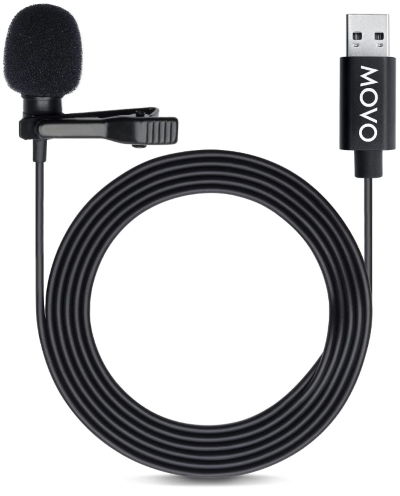
MOVO Lavalier Microphone is just £22.95 at the time of writing

As used by news broadcasters the world over. A lavalier microphone discretely clips to an item of clothing and can do a great job of improving sound quality

This Movo M1 is a great example, and it’s only £22.95 on Amazon at the time of writing. It’s genuinely “Plug and Play” so all you have to do is plug it in and select it as the microphone you want to use when making Zoom/Teams etc video calls.

With a 6m cable it doesn’t matter how far you are away from your computer, either

As well as the mic you get a clip to enable you to attach it to your tie (hence the name “tie clip microphone” but you can clip it to lapels, shirts and blouses too), and 2 foam windshields to help minimise wind (and breathing) noises.

Yes, you can buy cheaper but I wouldn’t recommend it.

USB Microphone Option 2 – Dynamic Microphone

A dynamic microphone is typically what you’ll see used on stage, by singers, at concerts. They are robust and offer great quality. A step up from an inexpensive Lavalier. There are hundreds to choose from, from well established brands – such as Shure, AKG and Audio Technica – which guarantee great quality – to a myriad of no-name Chinese brands which have no track record and which I wouldn’t trust.

This image has an empty alt attribute; its file name is Audio-Technica-ATR2100-USB-dynamic-microphone.jpg
Audio Technica ATR2100 – USB

This is why I am recommending this Audio Technica ATR2100 – USB which is £59.30 on Amazon, at the time of writing.

It’s actually a bit of a bargain because not only does it have a USB connection but it includes a socket for headphone monitoring, and a headphone volume control. If you make the next step and start having guests and you start using a mixer and multiple mics you can also plug this in to your mixing desk using the built in, professional standard, XLR connector.

Helpfully, for desktop recording it also comes with a desktop stand and three cables. USB C to USB C (so you might be able to use it on your Android phone), USB C to USB A to connect to your computer AND an XLR cable to connect to your mixing desk,

USB Microphone Option 3 – Condenser Microphone

This image has an empty alt attribute; its file name is Marantz-Pro-MPM-1000U-condenser-microphone.png
Marantz Pro MPM1000U

Condenser microphones (also called capacitor microphones) are the high quality microphones of the recording world. They can offer the best recording quality of all the microphone types so if you are really serious about recording quality then a condenser microphone is the one to go for, and yes, you can pay £thousands. But you don’t have too.

My current microphone that I have connected to my main PC, which I use for Zoom/Teams calls, and which I used for recording my first 150 or so podcasts is this Marantz Pro MPM1000U. Again, it’s a USB microphone, so it’s plug and play. At the time of writing, it’s £49.99 but I have seen it reduced to around £35.00 on many occasions. Sound quality is first rate and reliably has been superb.

This image has an empty alt attribute; its file name is Microphone-stand.png
Neewer Microphone Stand

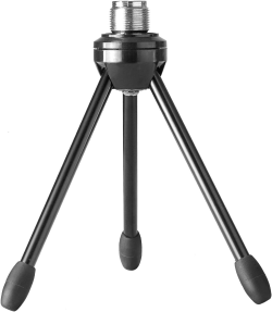
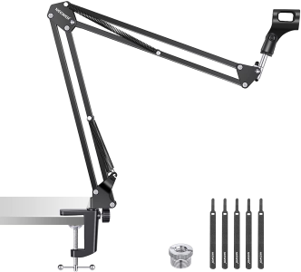
It comes with the all essential USB cable but to keep the cost down, it doesn’t ship with a desktop stand so you should factor in £20 or so for one, this Neewer is £16.49 at the time of writing. And you do need a stand because if you try to hand-hold the mic every time you change the way you hold the microphone the sound will be carried across to your call.

Microphone Accessories you might find useful.

This image has an empty alt attribute; its file name is Boom-arm-microphone-stand.png
Neewer Boom Arm Microphone stand

In my little Podcast recording studio I have a small mixing desk, so I can use two or more microphones, boom arms for my mics – so they can be pushed up out of the way when not in use and pop filters.

Pop filters help reduce the plosive consonants, those that are made when words start with a P, B, T, D, K and G. They all produce a puff of air. You probably won’t notice them but your microphone will and they can totally overwhelm your recordings.

This image has an empty alt attribute; its file name is plosive-filter.png
Plosive, or Pop Filter

I use a small mixer too. It extends the range of microphones you can use (and the number too) and can also add tone controls, adding (or removing) bass, treble and sometimes middle frequencies add sound effects, such as reverb, echo etc.

Again, there’s a myriad of mixers to choose from. In fact it’s a potentially confusing and complicated market if you are new to it. I prefer well established European and US brands for their proven track records and ability to get repaired should they break down. My current mixer is a Studiomaster, but I’d be more than happy with the Behringer you can see on the right if I were starting out.

This image has an empty alt attribute; its file name is Behringer-ZENYX-Q802USB-Mixer.jpg
Behringer XENYX Q802USB Mixer

I use my mixer with a selection of microphones, a non-USB Marantz MPM1000 condenser, my new Shure dynamic microphone, my old (and trusty) Shure SM58 – as seen on stage used by the majority of artists – and a couple of other microphones, two boom arms and two pop filters.

And on the mixer front, you won’t find one that will take USB microphones and if you choose to make a different choice, remember to look for one with USB outputs to make it easier to connect to your computer.

If you need help with your audio recording, or Podcasting, you can always get in touch. Email andy@enterprise-oms.co.uk, phone me on 01793 238020, call (or SMS) 07966 547146 or hunt me down on my Socials, LinkedIn and Twitter, and I’ll be only too happy to help.

What does your Phone Number tell people about your business

For years and years the Americans have been very clever with phone numbers, using words to make them memorable, 1-800-468 3647* is quite tough to remember, but using the letters on a phone pad it instantly becomes 1-800 Hot Dogs, which is far more memorable. I also reckon that it made for quite a fight between businesses and telephone companies for the best numbers. The best we seemed to manage in the UK was the fight for “special” numbers – such as 0800 123123

And then came the mobile phone explosion, and the numbers you used were the ones handed out by your mobile phone company, there was no choice. Well, there was, but you had to hunt it down and “special” mobile phone numbers were expensive, because the providers knew the value.

Telephone keypad showing letters and numbers

For a long time, companies would display both landline and mobile numbers – and quite a few still do. However, for the last 5 years (maybe more) I have noticed that a lot of companies only use their mobile number. This is possibly sole traders and other businesses who work from home, or a home office. It enables them to easily keep business telephony separate from private. I’ve worked with many people who have 2 mobile phones, 1 for business and the other for personal calls.

A sign written van with just a mobile phone number

But there are still people who won’t trust a company that only uses a mobile number simply because it used to shout “rogue trader” or similar, a company lacking any form of physical base.

I’ve also noticed that more and more sign written vans only have a mobile number on them, and in my opinion, this is a missed opportunity.

Why should a mobile only number be a missed opportunity?

Simply put, a mobile phone is harder to remember than a geographic number. Mainly because we are familiar with a range of geographic numbers (020 for London, 0117 for Bristol for example) and this makes them easier to remember – and the pattern is more familiar too. Especially if it’s the geographic descriptor for your local area (01793 in my case).

And this is the next benefit. If I see a tradespersons’ sign written van and it has a landline and mobile number, I’ll instantly know whether they are local to me, or “just visiting” and I’ll be far more likely to contact a local trade than one based elsewhere.

But landlines have their own issues. If you change phone providers, move from one exchange region to another or move from one office to another you may not be able to “take” your landline number with you. This means you’ll have to update websites, your Socials, letter heads, compliment slips, business cards etc. Which is a very good reason for just using a mobile number.

Is there a better way to use phone numbers?

Get an IP (Internet Protocol) phone number. An IP number is a virtual phone number. It’s not associated with any telephone exchange but is based in the Internet. You can have a physical desk phone (but you need one that’s IP Phone capable, not a cheap £10 phone from Amazon). You can use your PC/Laptop/tablet instead. Simply set up an IP Phone App and configure it correctly, have a headset and microphone (Bluetooth is great) and your “good to go”. You can even take IP calls on your mobile phone, yes really.

And, best of all, when you move location you don’t have to do anything at all. Your phone number comes with you, wherever you choose to go.

You could even get an IP phone number for the next town/city that you want to expand in to, giving you a virtual presence there and making it even easier for potential clients to contact you.

If you need help with your telephony then I probably know enough to be able to point you in the right direction and if you need assistance with your SEO, Email Marketing, Social media or any other type of online marketing activities then I can definitely help you so you really should get in touch – even if it’s just for a free consult. You can call me on 01793 238020 or 07966 547146, email andy@enterprise-oms.co.uk or book a slot using my calendar and we’ll take it from there

*(1-800 being the US equivalent of a free phone number, known in the States as a Toll Free Number)

National Cyber Security Month

October is National Cyber Month.
What is National Cyber Security Month?

National Cyber Security Week

Threats of Cyber Crime from Cyber Criminals continue to increase and we all need to be increasingly alert and focussed on the threats, the impact they could have on our lives AND the things we can do to minimise the risk to ourselves and our businesses.

Red spot on code

National Cyber Security Month 2021 has the overarching theme “Do your part. #BeCyberSmart” and looks to empower individuals and businesses to own their role in protecting their part of cyberspace.

If we all do our part then we will all benefit from a safer place to live and be in a safer place to do business. Not only that but we’ll also be denying the cybercriminals the space they need to extort, employ fraud and generate the money they lust after.

How can we contribute?

We can all look to implement stronger/better security practices such as not clicking links in emails, not opening emails from people we don’t know or even opening emails we weren’t expecting. We can install security software on our phones, our tablets and our computers. We can use stronger passwords, and make sure we use unique passwords for EVERY application.

Each week, National Cyber Security Month will have a different focus, starting with Week 1 – Be Cyber Smart

Week 1, Starting October 4 – Be Cyber Smart

log on box

Our lives are increasingly intertwined with the internet and the World Wide Web. Pretty much all personal and business information is stored on internet connected platforms.

From banking to social media, from email to SMS, from phone and video calling to watching TV and listening to music and beyond.

The internet simplifies some areas of our lives and makes it more complex in others but the one, overarching common factor, is the need for a strong level of security to keep our data safe.

That’s why Week 1 of National Cyber Security Week focuses on the best security practices and “cyber hygiene” to keep our data safe, owning our role in Cyber Security and starting with the basics. That includes using unique, strong, passwords and making sure that we use multi-factor authentication (2FA) where it’s available, preferably avoiding SMS (text Message) authentication where possible.

Week 2, Starting October 11 – Fight the Phish – Trust No One

Phishing attacks, where emails and text messages are sent containing web links encouraging you to click the link, visit a website set up by cyber criminals and enter your user names and passwords are still on the increase. Why are they on the increase? Because they work. People see an email that purports to come from their bank, HMRC, DVLA, Post Office, BT etc. and are given a warning claiming that the recipient needs to do something NOW or they will be locked out of their account, will be arrested, won’t have an order delivered …. or one of many other ruses. You click the link and either have malicious software sent to your computer without your knowledge and approval or give away user names and passwords to cyber criminals, enabling them to access your personal accounts and to steal from you.

The X-Files mantra of “Trust No one” applies here. Any email that contains a request for such information should always be approached with caution and, if you have even a small inkling of concern, then simply open your web browser and visit the website of the sender to check out the veracity of the email.

Week 3, Starting October 18 – Explore, Experience, Share

Week three focuses on the National Initiative for Cyber Security Education (NICE), inspiring and promoting the exploration of careers in the cybersecurity sector. Whether you are a student or a veteran or seeking a career change, this week is all about the exciting, ever changing, field of cyber security, a rapidly growing business sector with something for everyone

Week 4, Starting October 25 – Cybersecurity First

The last week of National Cybersecurity Month looks at making security a priority. Actually taking a Cyber Security First approach to designing and building new products, developing new software, creating new Apps.

Red spot on code

Make Cyber Security Training a key part of onboarding when taking on new employees (and, at the other end, making sure that technology rights are revoked when people leave organisations).

Ensure that your employees are equipped with the cyber secure tools that they need for their jobs. If you practice a BYOD (Bring Your Own Device) policy, allowing employees to use their own phones, tablets and computers then you need to ensure that the cyber security deployed is as strong as that on equipment that you provide.

Before buying new kit, or signing up to a new service, do your research, check the security. Is it secure enough? Can it be made more secure? Can it be remotely wiped? Who has control? All of these questions, properly answered, will ramp up your cyber security defences and help keep the cyber crims at bay

When you set up new equipment, that new phone, tablet or laptop, I know it’s exciting but please invoke the Cyber Security first, don’t leave it until last – it might be too late. Make sure default passwords are replaced with something secure and lock down those privacy settings.

Cyber Security MUST NOT be an afterthought. If it is, you could find yourself paying the price

And if you need some help, you can always ask me. I might not know the answer but I know people in the Cyber Security industry that I can put you in touch with. Email andy@enterprise-oms.co.uk, phone/message me 07966 547146, call 01793 238020 or message me on Social Media and we’ll get it sorted.

What’s the Difference between the WWW and the Internet?

Although people seem to use the terms WWW and Internet interchangeably, the two are actually very different beasts

The Internet

There is a belief that the Internet came about through military research. The US government needed to find a way to send the “launch” message to ICBM silos in the event of the telephone network being disabled.

Although the US military contributed to the formation of the internet it was a lot more than this, and was mainly in the academic domain.

A visual representation of the Internet by The Opte Project

In the early 60s various projects in the US, UK and France had the aim of building, and interconnecting, computer networks, particularly the Super Computers of the day, for data sharing and data transmission.

In 1974 research was published that evolved in to the Transmission Control Protocol (TCP) and the Internet protocol (IP), the basic technologies that are used to send computer data from one location to another.

In the early 80s the American National Science Foundation funded a number of supercomputers at several US universities, provided interconnectivity between them and also built a network that allowed by other academic institutions for research. This marked the beginning of the internet.

The first Internet Service Providers emerged in the USA & Australia in 1989 and in 1990 a small number of commercial entities in the USA were provided with private connections to this network. Connectivity increased rapidly, and the Internet as we know it, was born.

The Internet is the structure along which data travels when going from A to B and can be likened to a road network. And, like a road network, there are some routes that are faster than others and even the fast routes suffer from occasional issues and blockages which slows things down.

The World Wide Web

In 1989-90 research at CERN, in Switzerland, by British computer scientist, Tim Berners Lee (now Sir Tim) saw the development of a technology that linked hypertext documents in to an information system which was then accessible from any node (connection) on the network.

Sir Tim released his research in tot the world and allowed it to be used without any license fees and this allowed it to become the defacto document standard for the world wide web. This is why all web addresses start with HTTP, it defines the protocol to be used to transmit documents, Hypertext Transmission Protocol although we are now more familiar with HTTPS where the S adds Secure.

Basically, the Internet is the structure along which the data travels (the road system mentioned in the previous section) whilst the World Wide Web is the data that travels across that network, like traffic on a road.

If you need any help with your presence on the World Wide Web, from your website through Search Engien Optimisation (SEO), Advertising or anything else I’ll be more than happy to have a free chat to see how/where I can help your business. All you have to do is call me on 01793 238020, email andy@enterprise-oms.co.uk or just search Chief SEO Officer.

Is having a Responsive website enough?

When I started using the internet to access the world wide web, back in the early 90s I had a 14″ monitor with a 640×480 resolution. That’s 640 pixels (dots) wide and 480 pixels high, smartphones did not exist and connection was made via a modem (US Robotics) and a dial-up (phone line) connection.

This image has an empty alt attribute; its file name is screens.gif

Then I started working for an IT company and moved up to a 15″ screen with a 800×600 resolution and could get more on my screen. I was really excited when I moved to a 17″ screen with a 1024×768 resolution. Not only could I be more productive but we moved to an ISDN (digital connection) and the world was a better place.

Although I had been using a smartphone for a while (I am a bit of a geek) the adoption of a phone with a screen really took off in 2007, when after 2 years of development, Steve Jobs announced the very first iPhone.

This introduced a problem for web designers and developers. Screen resolution was 420 x 480 and sites developed for traditional monitors tended to not work very well on Smartphone screens. Monitors were wider than they they were taller – SmartPhones were taller than they were wider and so a lot of horizontal scrolling was required. And this was just horrible.

As a consequence, web developers started to design mobile only websites. A bit of code on the home page would identify whether the site was being visited by a desktop (or laptop) PC or by a mobile device and the visitor would be seamlessly forwarded to the relevant site. The mobile site would commonly be identified by an m. so the regular site would be www.website.com and the mobile version would be m.website.com.

The first iPhone

However, this meant that web developers had to build two different sites, which took time and money so wasn’t an ideal solution.

By 2008 work was well underway developing a technology that would overcome this and allow a single site to be developed. One that would automatically change its size depending on the device being used to access it. Initially these were called by a variety of names, “flexible”, “fluid”, “elastic” and “liquid” being the main terms used. In May 2010 the word “responsive” was used for the first time, by 2012 “Responsive” was #2 in Top web Design Trends by .Net magazine and 2013 became the Year of Responsive Web Design according to Mashable. In the same year Google announced that it was going to reward responsive designs with improved rankings and the flood gates opened.

By 2014 mobile web access exceeded desktop access for the first time and in 2019 Google switched focus from desktop first when evaluating websites to taking a mobile first approach.

Now, barely a website is built unless it’s “responsive” but this brings it’s own set of problems.

In my experience, most companies who request a Responsive site rarely take a detailed look as to how quickly the responsive site loads, how it looks and how easy it is to use. They quickly check on their phones and, provided the site looks OK, they accept the design they have been given.

And that’s where the problems start. It’s very easy to build a Responsive website, especially in WordPress, and even easier to make it slow to load (remember, you have less than 3 seconds to get your site open and just 2/10ths of a second for the visitor to understand what’s on offer)

Lots of sites still use carousels, those scrolling images that feature at the top of web pages (you can read about my dislike of carousels here). This means that all carousel images have to load first and the worst responsive sites with a carousel simply display all the carousel images, stacked one above the other.

Although people can scroll easily on a phone, they have to understand what they are scrolling for and a lot of people simply won’t bother, especially when faced with 2 or more images.

How good is your website when viewed on a smartphone?

How do you know that people don’t like the Responsive version of your website? It simple, log in to your Google Analytics account and look at the initial “quality” metrics for the three device types, desktop/laptop, mobile and tablet.

Three Quality Metrics

For a quick site performance overview I always look at the average length of each visit to a website, at the average number of pages per visit and the Bounce Rate – the number of visitors who reach your website but leave without clicking on anything. By navigating in Google Analytics to Audience/Mobile/Overview you’ll see a chart, similar to the one below,

Bounce Rate Mobile Vs Desktop Vs Tablet

Remember my simple Bounce Rate scale
0 – 20% = Excellent (and very rare)
21% – 50% = Average
+51% – Investigate

In the above example you can see where the problem lies, Desktop and Tablet Bounce Rates are comfortable, around the 40% mark whereas visits from Mobile devices have a Bounce Rate of nearly 64%. That means that 2/3rds of ALL visits from users using their phones leave without doing anything. Totally wasted opportunity and even if the company increases it’s marketing to attract more visits, this will only continue unless action is taken.

What should the site owner be doing

It’s really simple.

You need to fully understand the goal of your website. I know that sounds simplistic but so many people have a website because they feel they need one but don’t really have any specific goals.

Your site should have clear goals and it should be immediately obvious what those goals are. Do you want visitor to your website to

  • Buy Something
  • Place an order
  • Subscribe to a newsletter
  • Make contact to ask a question
  • etc

Now all you have to do is open your site on your phone and take a good look. How fast does the site open? How quickly can it be used? How obvious is the primary goal? How easy is it for a visitor to carry out the primary goal.

Make notes about the performance and have a conversation with your web designer to sort everything out and if you need help, you can always get in touch for a chat (no cost, no obligation) or you can leap straight in and book a website review – Saving £50 in my autumn 2020 Special Offer.

I can provide advice, help, and support. Just give me a call on 01793 238020 or email andy@enterprise-oms.co.uk and we’ll take it from there

Boing, Boing, Boing. What’s the Bounce Rate?

I’ve been a fan of Google’s web metrics tool (Google Analytics) since it was introduced in 2005. For most businesses, it’s free to use. The necessary tracking code is easy to add to your website and provides a wealth of information about your site’s performance but the Bounce Rate is one of the most powerful metrics, a powerful insight into the minds of the people who are visiting your website.

And yet all the Bounce Rate does is record the percentage of people who visit your website but leave almost straight away without doing anything more than viewing the page they landed on.

With 15 year’s experience, my view of the Bounce Rate is as follows

0-20% – Phenomenal. In 15 years I think I’ve only come across 4-5 sites with a Bounce Rate in this area and one of those was only because the site hadn’t installed Google Analytics correctly.

21-50% – Most of the sites that I work with fall into this region. One where between 1 in 5 and 1 in 2 visitors leave the site without doing anything

+51% – Any website with a Bounce Rate of 51% and higher really needs the reasons investigating. These sites are hemorrhaging visitors and, more importantly, opportunities but HOW do you go about analysing a high Bounce Rate and turning things around.

Remember, a 51% Bounce Rate (BR) means that over half of the people that you have persuaded to visit your website, whether that’s by SEO, Google Ads, Social Media (And Social Media advertising), e-mail and video marketing or simply word of mouth are just leaving without doing anything meaningful. If your website were a shop, they’d be sticking their head through the door, shrugging their shoulders and moving on. As a consequence, this has to be worth investigating. After all, if you invest in more marketing, all that’s going to continue to happen is that over half of those you attract will just do as the 51%+ have done before – and leave.

Working to reduce the Bounce Rate. Where do you start?

First, ensure that you have a really good understanding of your website because if you don’t know what you want your website to do for your business how do you know whether it’s doing it – or not.

What are the goals of your website? Here are some common ones.

  • To sell something
  • To attract newsletter subscriptions
  • To encourage inquiries
  • To allow people to download something

If your website has a high Bounce Rate where do you start looking? There are many ways to approach this, but I always like to start by taking a look at the website itself. What message is it sending to visitors?

Let’s say, for example, that you sell widgets and those widgets are used to attach the engines to an airliner.

Having a large photo of an airliner at the top of your home page probably looks good to you. And, because you know that your widgets play an important part then it sends a message – to you, and you alone. To everybody else all it actually says is “here’s a pretty picture of an airliner”. Questions that could come into the visitor’s mind might be “is this a travel company?” “do they make the whole airliner” – not – “aha, these are the guys that make the widgets that hold this airliner’s engines on”.

Remember, although you may have 3 seconds to get your webpage open in front of your visitor that’s an eternity compared to the 2/10ths of a second that a visitor takes to “get” your website……..or not!

Once happy with the website the next place that I’d look would be at marketing activity. Are the messages being broadcast by the marketing actually delivered by your website? For example, it’s no good talking a two-for-the-price-of-one offer if there’s no mention of it on your website, or if the offer is difficult to find. Visitors won’t look around – they’ll leave (bounce) and may never come back

Now that the marketing messages align with your website, and your website is as good as it can be, it’s time to dive into the data provided by Google Analytics.

Using Google Analytics to troubleshoot the Bounce Rate

The first place I look is the source of your web visitors.

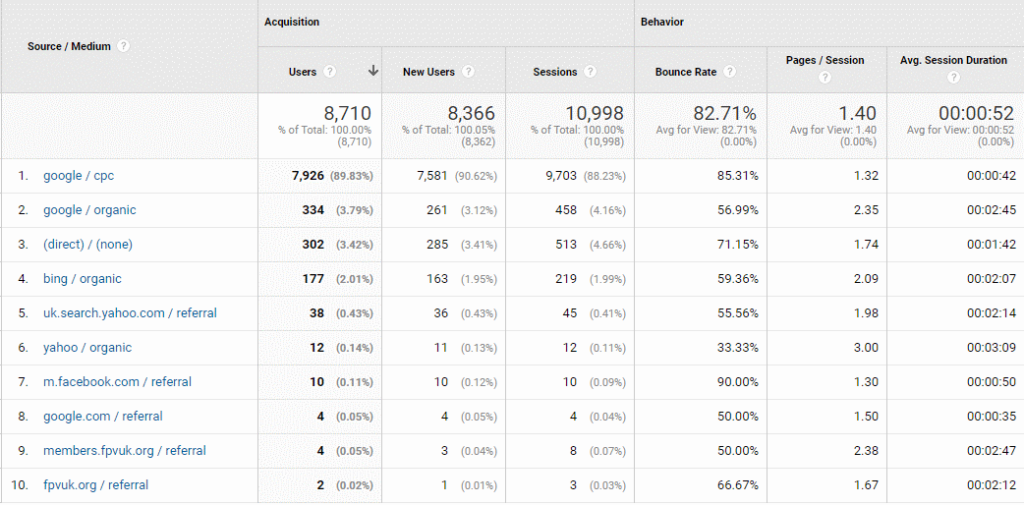
Google Analytics/Acquisition/All traffic/Source/Medium will answer this one

Website traffic Sources in Google Analytics
Website Traffic Sources in Google Analytics

Traffic Sources Key

Any entry that’s tagged “/referral” is where a visitor to your site has followed a link published on a 3rd party website. This could be an indicator as to how your online marketing is performing

  1. CPC = Google Ads
  2. Google Organic = Google Free Search Results
  3. Direct = Either Google can’t identify the source or people have entered the URL directly in their browser
  4. Bing Organic = Traffic from Bing (Microsoft search)
  5. UK Search Yahoo Organic = Traffic from Yahoo UK
  6. Yahoo Organic= Traffic from Yahoo
  7. m.Facebook = Traffic from Facebook on a phone or tablet
  8. Google.com = Traffic from Google.com
  9. Traffic from a third party website
  10. Traffic from a third party website

For this particular website, you’ll see that the Bounce Rate is very high for the majority of traffic sources and particularly high for visitors from Google Ads. With the majority of sources having a high Bounce Rate it would appear that the problem either lies with the marketing that is attracting the wrong people to the site, the website is failing to meet expectations or the problem lies elsewhere.

Bearing in mind that one of the earlier exercises was to ensure that marketing was sending the right message it’s obvious that, for this website, the problem with the Bounce Rate lies somewhere else

Geographical Source of traffic

Navigate to Audience/Geo/Location in Analytics

Scroll down past the map to see the countries where the traffic is coming from. You’ll see the Bounce rate for each source country. If you are targeting the UK and your UK Bounce Rate is OK then the next step is to try to understand how your marketing is promoting your traffic outside of the UK.

It’s possible that your website is attracting visitors from markets that you don’t serve. I have seen a number of sites that have attracted a lot of visits from the USA. When American visitors have landed it becomes immediately obvious that the website can’t address their needs so they leave immediately (Bounce).

The reality is that there is probably very little that you can do about this but it’ll be a relief to see that the Bounce Rate for your target locations is OK.

For this site, the Bounce Rate is high for all countries so the answer doesn’t lie here and the hunt continues

Visitor Demographics

Navigate to Audience/Demographics/Age in Google Analytics

Although Google can’t identify all visitors to your website it’s still worth checking the visitor demographics. You can check that your website is reaching the age groups that your business is targeting.

Again, for the website being used in this blog, the Bounce Rate is high across the board so the answer lies elsewhere.

Navigate to Audience/Demographics/Gender in Google Analytics

Some companies target specific genders and this enables you to make sure that your visitors are coming from your target demographic. Once again, with a high Bounce Rate for both genders, the answer isn’t here. The hunt continues.

Web Browser Issues

Navigate to Audience/Technology/Browser & OS in Google Analytics

Web browsers are complicated pieces of software and it’s not unusual for websites to hit problems with some browsers and not others. This screen looks at the browsers used by visitors to your website and the Bounce Rate per browser. If a particular browser has a high Bounce Rate, but only delivers 5% of visitors (or fewer), it’s not worth paying too much attention. The cost to investigate, and resolve, the problem probably outweighs the benefits

This website is performing poorly in all browsers so the problem isn’t here either and the hunt continues.

Mobile Issues

Navigate to Audience/Mobile/Overview in Google Analytics

We are all used to accessing the web on our phones, but how well does your website work on small screens. It’s possible that this is the cause of the high Bounce Rate.

Now we’re getting somewhere. Desktop visits have a Bounce Rate in the comfort zone (44.50%) whilst phones and tablets are well above 50%.

Take a detailed look at your website, using your phone. Try to act as a customer and see whether you can spot any problems. Is the site slow? Is the navigation poor? Is excessive scrolling required?

Ask friends, colleagues, family to do the same, and feedback their findings and thoughts.

Next, take it up with your web developer.

Site Speed

Navigate to Behaviour/Site Speed/Overview in Google Analytics

I think we have gotten to the nub of the problem. This is a slow website. Although the server is quite slow to respond (0.36 seconds) the technical elements (screenshot above) taken to find the website and start to open it on a device are still under 1 second so the problem lies with the content of the website itself.

Navigate to Behaviour/Site Speed/Page Timings in Google Analytics

Google Analytics page speed performance chart
Page Speed Report – blurred to protect the company

This page looks at the performance of every page of your website and details the speed of each page as a + or – when compared to the site average. It helps to identify poor performing pages.

Navigate to Behaviour/Site Speed/Speed Suggestions in Google Analytics and Google will provide information and recommendations as to the actions you should take to improve the speed of your website. This might be a list that you take up with your web developer

Another way to identify issues is to put your website URL into https://www.webpagetest.org . This site runs a speed test three times and then displays the results as a waterfall graph, highlighting the speed of each element of a website, enabling you to identify problem areas.

A web page speed test waterfall chart

Summary

So, there you have it, a detailed look into the Bounce Rate, and the ways that you can use Google Analytics to identify issues so that you can take corrective action.

Thanks for reading and you need more help with your website’s Bounce Rate or anything else to do with your web marketing all you have to do is get in touch. I’ll be only too happy to answer any questions that you might have.

And Finally

Don’t forget that you can book a FREE 40 minute consultation with me.

Find me: https://seo.enterprise-oms.uk/  |  andy@enterprise-oms.co.uk
Follow Me: Twitter ¦ Linkedin
Phone Me: 01793 238020 ¦ 07966 547146

How clean is your keyboard?

One of my earlier posts was about the cleanliness of your phone, that’s your mobile rather than the phone on your desk, if you have a desk and still have a phone on it, that is.

If you do still have a desk there’s a good bet that it has a keyboard on it, either a laptop or regular desktop keyboard. I just hope it doesn’t look like this one.

Turn your keyboard upside down and give it a little shake to see what falls out. For a lot of people it’ll be a mix of the following

A very dirty keyboard
  • Dust
  • Dead skin
  • Breakfast
  • Snacks
  • Lunch
  • Sometimes dinner

Grossed out yet? You might be after you read this.

Consumer group Which? tested keyboards at its London office found keyboards regularly carrying bugs that could cause food poisoning

They tested 33 keyboards by taking a swab and sending the swabs of to be biologically tested for bacteria Four of the keyboards (12.2%) were regarded as a potential health hazard whilst one of them actually had five times (yes 5 times) more germs than one of the office’s toilet seats.

Even more disturbingly, tests from a survey carried out by the University of Arizona found that the average desktop actually has 400 times more bacteria than the average toilet seat and, apparently, women’s desks were worse than men’s.

Chicago’s North-western Memorial Hospital found two deadly drug-resistant types of bacteria (vancomycin-resistant Enterococcus faecium (VRE) and methicillin-resistant Staphylococcus aureus (MRSA)) could survive for up to 24 hours on a keyboard, while another common but less deadly bug (Pseudomonas aeruginosa) could survive for an hour.

One of the microbiologists said “your keyboard was often a reflection of what is in your nose and in your gut”………

How to clean your keyboard

It’s a good idea to give your keyboard a regular spring clean (and not just in the spring). Start off by shutting down your PC. Don’t put it to sleep, or stand-by, you’ll wake it up when you start.

Some keyboards are waterproof – if you are lucky enough to have one of these then just pop it in to the dishwasher……BUT CHECK FIRST

If not but you have access to a can of compressed air, then use that to blow debris out from between the keys. If you don’t have a can of air you can just turn your keyboard upside down and give it a gentle shake to get all the crumbs out.

Now get a cotton bud and dampen it with water or rubbing alcohol and use it to clean between the keys.

You can also use silly putty

Finally, gently wipe your keyboard soft, lightly damped link-free cloth and finally, finish off by disinfecting with alcohol wipes.

Alternatively, you might be able to pop the key-caps off and wash them separately. However, make a note of where the keys go first. I can remember the time when a former colleague decided this was a great way to clean his keyboard so he popped all the key caps off and washed then in a bowl of warm, soapy water. Once clean he left them to dry and then was faced with a lot of little places where the key-caps belonged……..but he didn’t have a clue which ones went where so ended up buying a new keyboard anyway

Suddenly it makes sense to keep a packet of alcohol wipes in your desk drawer

Obviously I can’t help you with the cleanliness of your desk and keyboard but I can help you with the cleanliness of your SEO, Social Media and other forms of digital marketing so if you’d like to talk about your online marketing then just pick up your phone (wipe it first) and give me a call on 01793 238020 or email andy@enterprise-oms.co.uk